The High DPI Transition
 I suppose I'm pretty slow realizing this, but in reading Dave Hyatt's post "High DPI Web Sites" and then John Siracusa's excellent post "Declaration of resolution-independence" I finally realized what all this means for developers: one more expensive transition and lots of work for great graphic artists.
Typically when you purchase your graphics you buy them at a given resolution. For an app icon you currently only have to purchase:
1 app icon at 16 x 16 pixels
1 app icon at 32 x 32 pixels
1 app icon at 48 x 48 pixels
1 app icon at 128 x 128 pixels
Or for each toolbar icon you'll need:
1 toolbar icon at 32 x 32 pixels (NSToolbarSizeModeRegular)
1 toolbar icon at 24 x 24 pixels (NSToolbarSizeModeSmall)
For each document icon you'll need:
1 app icon at 16 x 16 pixels
1 app icon at 32 x 32 pixels
1 app icon at 48 x 48 pixels
1 app icon at 128 x 128 pixels
Now according to this document, "Icon Services in Tiger has been extended to support icons that are 256 x 256 pixel in size" so we really should add 1 more app icon size and 1 more doc icon size, but let's just say we're on a budget. The point is with icon design you typically pay per pixel size.
To make you application look good on a high resolution screens you'll need to re-purchase either higher resolution versions of your icons, or purchase the full PDF or PSD versions which cost a LOT more than say the 32 x 32 version of the same graphic. For icon designers this could be quite the wind fall. :-)
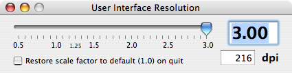
Just for fun: For those of you who don't have Quartz Debug installed here are some interesting screenshots taken from my MacBook Pro with Tiger 10.4.6 at different resolutions:
I suppose I'm pretty slow realizing this, but in reading Dave Hyatt's post "High DPI Web Sites" and then John Siracusa's excellent post "Declaration of resolution-independence" I finally realized what all this means for developers: one more expensive transition and lots of work for great graphic artists.
Typically when you purchase your graphics you buy them at a given resolution. For an app icon you currently only have to purchase:
1 app icon at 16 x 16 pixels
1 app icon at 32 x 32 pixels
1 app icon at 48 x 48 pixels
1 app icon at 128 x 128 pixels
Or for each toolbar icon you'll need:
1 toolbar icon at 32 x 32 pixels (NSToolbarSizeModeRegular)
1 toolbar icon at 24 x 24 pixels (NSToolbarSizeModeSmall)
For each document icon you'll need:
1 app icon at 16 x 16 pixels
1 app icon at 32 x 32 pixels
1 app icon at 48 x 48 pixels
1 app icon at 128 x 128 pixels
Now according to this document, "Icon Services in Tiger has been extended to support icons that are 256 x 256 pixel in size" so we really should add 1 more app icon size and 1 more doc icon size, but let's just say we're on a budget. The point is with icon design you typically pay per pixel size.
To make you application look good on a high resolution screens you'll need to re-purchase either higher resolution versions of your icons, or purchase the full PDF or PSD versions which cost a LOT more than say the 32 x 32 version of the same graphic. For icon designers this could be quite the wind fall. :-)
Just for fun: For those of you who don't have Quartz Debug installed here are some interesting screenshots taken from my MacBook Pro with Tiger 10.4.6 at different resolutions:


5 comments:
This is something that Microsoft have got nailed with WPF in Vista - a properly resolution independent interface, using mainly vectors. Apple are not doing anything like this yet, so I'm hoping that such a feature is added to Leopard, even though I can't see an immediate use for it.
Also, IIRC, Microsoft uses a Truetype font to generate the minimize / maximize / close icons. So they already scale properly in XP at low dpi's. (The app icons are a different story.)
I am rather surprised that Apple doesn't use higher resolution widgets.
This is vewy vewy interesting?
very cool, especially if you see how it is managed in xp^^
Heck, Windows has had a basic form of this around forever, in the form of the "large fonts" setting. Originally, all it allowed was to change between a logical DPI of 96 ppi and 120 ppi. [In Windows XP, there's no such limitation: Start/Control Panel/Display/Settings/Advanced/General tab/DPI setting.] Unfortunately, most applications, including Windows Office '97, did not abide nicely by those settings by StretchBlting icons to their new size -- they interpreted the setting as purely a font size change rather than an indication to scale all controls accordingly.
I'm still waiting for a time that I can switch from 1024x768 to 4096x3072 with a "fixed size on screen" checkbox checked, and have the text and graphics all remain the same size, but just get substantially more clear. I still think the software side of this will be easier to accomplish than the hardware side of increasing pixel density (so I can do the aforementioned switch on my 15" PowerBook).
Post a Comment