Showing posts with label design. Show all posts

21 April 2008

Metacognitive Miscalibration

A few tweets ago, (I always feel weird referring to Twitter in the past tense) I posted: Why are the unintelligent or uninformed so arrogantly confident while the intelligent and well informed so often unsure and apprehensive? There is something very human to thinking you know more than you really do about a subject or issue. While, this problem can be seen in many areas generally it's particularly acute in software development. For example...

AppleScript in Office X

Back when Mac OS X was just about to go 10.0.0 we were busy working on getting Mac Office working on the new platform. There was a lot of pain involved with the transition. Many APIs had been removed and alternatives needed to be provisioned (and tested), the new Aqua interface guidelines had to be applied to the whole of Office and a host of other issues needed to be addressed. I was at the time on the team that wrote the tools for automated testing and I was pushing hard to get Office wide AppleScript support on the list of features we'd commit to doing for Office X. I wanted this not only for our customers, but to augment our testing efforts. With an API to drive the applications we could automate many "smoke tests" on a daily basis as well as set the stage for long term AppleScript based test suites. Automation testing benefits are often not fully realized, especially static automation, until the version after you setup the automation, so I was especially anxious that we get our API in Office X, so we could reap the return on investment for Office 2004.

I remember talking with Jim Murphy about getting AppleScript support like it was yesterday. We were in building 44 and his window office was near the 2nd story walkway that connected our building to the cafeteria. In my naivete I asked why we couldn't just build a some kind of layer to call into the engine code of Office and presto, AppleScript dictionaries for Office would be complete. I pointed to some improvements Apple had made to make AppleScript a better inter-application communication protocol and ask, "How hard could it be?" Jim turned to me and said, "Hard? There's nothing easy about it. It's all pain. All pain." Then as was typical, turned back to his work, leaving me to think.

In this case, I was the unintelligent and uninformed, but very enthusiastic novice. Jim turned out to be right. For Office X, we did try to do the AppleScript work, but it turned out to be much more difficult a problem to solve. After months of work and many dead ends, we pulled the feature from the Office X feature list. For Office 2004, we tried again. In this case, Jim himself, one of our best developers, ended up spending the better part of a year getting AppleScript to work with Office, which is probably worth another post in and of itself. I thought I knew more than I did, I thought the problem was simpler than it was. My confidence and thinking was miscalibrated. The root cause was my lack of understanding and experience.

Wicked Problems

Sometimes, even the best developers underestimate the scope, breadth and depth of a problem. In a drive for simplicity, I observed in myself and others another kind of design time problem where thinking was miscalibrated. The cycle I have observed looks like this:

  1. Developer looks at a problem A, and thinks he or she fully understands the problem.

  2. Developer designs a simple solution to problem A.

  3. Developer codes the simple solution.

  4. Developer or tester or marketing or customer use simple solution for problem A.

  5. Bugs trickle in and solution A is modified, bit by bit, bug by bug, until it is patched in a thousand ways and no longer looks or acts like the simple solution. The solution is complex.

Some will say, "Hey! Why didn't that lame developer take the time to really understand the problem? Then he could have taken the time to fully comprehend the complexities of the problem, and then design a simple, elegant solution!" The problem with this is that many subtleties to the problem do not manifest themselves until very late in the development process which make re-architecting the solution for such a small issue un-reasonable. But this is a "death by a thousand paper cuts" issue. What's worse, many architectural issues can only be comprehended after years in a problem space, and as promotions or attrition happen, the so called simple solutions, with their complex instantiations proliferate in code.

Adam Richardson spoke to the challenges of wicked problems when he said:

Wicked problems are very difficult to understand by staring straight into them and looking for clear detail, however. They need to be approached from the edges, sort of like doing a jigsaw puzzle where you find the edge pieces first. Having peripheral vision that is trained to be sensitive to the edges is a key capability (this applies both to product teams and to business units - wherever wicked problems occur).

Normally this causes the developer to tack on simple solution to solutions with patch upon patch applied with the Hippocratic Oath echoing in their ears to "do no harm", but deceptively the bandage is not big enough for he wound, and no one knows.

The Desire to Learn

Another reason why some can feel "informed" when in fact they are not is that they have lost the hunger to learn. They've lost the desire to learn and grow. René Descartes said it this way:

Good sense is the most equitably distributed of all things because no matter how much or little a person has, everyone feels so abundantly provided with good sense that he feels no desire for more than he already possesses.

There is a reason for diversity of opinion, it provides the natural tension that keeps us from thinking we've got the problem solved. When I left Microsoft to go back to school and finish my degree, many asked, "Why are you doing that? What are they going to be able to teach you?" I'll admit that this partially resonated with me. I wanted to be the sage of wisdom, but as I've spent time with teachers and students, many of whom do have less "industry experience", I have learned an enormous amount! To put it bluntly, I have been humbled. I've learned things technically, intellectually, physically and even spiritually. I feel so blessed. I'm beginning to think that what any given situation can teach you depends largely on the person experiencing the situation and very little on the experience itself. Put another way, there's a great difference between 50 years of experience and 1 years worth of experience repeated 50 times.

Personal Pride - the Anti-change Agent

Closely related to the lack of desire to learn is the desire to avoid being wrong. So much in school is focused on being right, knowing the right answer to a test or the correct proof or solution. In sports, no one likes to lose. Everyone likes a winner! But this desire can work into our minds in a limiting way. Leo Tolstoy wrote:

I know that most men, including those at ease with problems of the highest complexity, can seldom accept even the simplest and most obvious truth if it be such as would oblige them to admit the falsity of conclusions which they have delighted in explaining to colleagues, which they have proudly taught to others, and which they have woven, thread by thread, into the fabric of their lives.

At work I would say, "We don't fail half as much as we need to." I still think this way, but now I've found a new reason: Failing keeps our mental muscles and joints from stiffing with pride and forming into the arthritis of the mind.

The Well Intended Deception

Another reason for metacognitive miscalibration I think stems from the very basis of good object oriented abstraction and encapsulation. When I write some simple app with Cocoa's AppKit and Foundation libraries, I am, as they say, standing on the shoulders of giants. I've wondered how many actual lines of code are called when I double click a simple app like TextEdit. Who wrote these lines of code? When did they actually get written? What were the discussions behind their design and implementation? Even Apple couldn't fully answer these questions. It is all this code that even the simplest of Cocoa applications depends upon. But still we continue to have demos around how "few lines of code" were needed to accomplish something. This is a well intended deception, because really, more code is being executed and written, but only now how this code works is opaque. It's well intended because who wants to write, maintain and debug more code? Why not offload this to Apple? I expect these demos to continue, because less code for a developer to write is the canonical example of efficiency, but there's something wrong that comes from this. It's the feeling that you actually really understand what is going on to make your application tick. These assumptions and abstractions can be benign, but they can also make one feel and think that they know more than they do and can do more than easily possible.

In the process of detail management that is software development, making things simpler and more tractable is an excellent goal, but there's a limit to how "simple and easy" things can get and still be valuable. Recently I overheard two students talking about building an iPhone application. The one said to the other, "Dude, they showed this awesome demo of Spore, where in only 2 weeks, 2 weeks! they got this awesome iPhone game running! It's so easy. We can totally build an awesome iPhone app!" First, I love the enthusiasm and I hope they do in fact build an awesome iPhone application. Apple was trying to demo how easy it was to build iPhone applications and I think we've never seen a mobile platform that's better for developers, however:

Taking a senior developer who as spent the last several years of his life building games and developing Spore, bringing him into Apple with full and uninterrupted access to Apple's staff of iPhone engineers that have been developing the iPhone SDK and iPhone applications hardly equates to a college student being successful at all the complexity involved with boot-strapping a company and building a successful iPhone application from scratch. Building great software is still hard, hard work. It's tedious, often un-glamorous and takes someone who doesn't mind getting down and dirty with the details to make something great. Most will simply give up, and even those with the passion and stamina to continue are hardly assured of success. I suppose I'm arguing simply that a healthy dose of Steve Job's famed "Reality Distortion Field" do not a great developer, company or software make.

There are probably other reasons we tend to think we know more than we actually do. But the lesson for me is this: I need to take some time to ponder and reflect regularly. Am I in the "unintelligent or uninformed and arrogantly confident" camp? If so why and how can I get humble? Am I part of the "intelligent and well informed but unsure and apprehensive" group? If so why and what can I do increase my tolerance for risk and decrease my fear of being wrong? A little meta I know, but the title should have warned you. :-)

26 February 2008

Heuristically Thinking

You don't have to understand calculus to appreciate this entertaining story:

A teacher, trying to explain what a theory is, asked this question: “If you take a letter half the distance to a mailbox and stop, then start over going half the remaining distance and stop, then repeat the process over and over, theoretically will you ever really get to the mailbox?” One bright student said, “No, but you’ll get close enough to mail the letter.”

There are many definitions for what a heuristic is, but the one I like best is illustrated in this story. A heuristic is "close enough." I am beginning to believe that more and more what matters in software isn't so much building the perfect algorithms, that match and mimic real life in every way and hold up in every edge case. What matters most is getting a model that comes close enough. What matters are heuristics.

My favorite chemistry textbook, has this to say on the topic of "The Kinetic Molecular Theory of Gases" (KMT):

However, although laws summarize observed behavior, they do not tell us why nature behaves in the observed fashion. This is the central question for scientists. To try to answer this question, we construct theories (build models). The models in chemistry consist of speculation about what the individual atoms or molecules (microscopic particles) might be doing to cause the observed behavior of the macroscopic systems (collections of very large numbers of atoms and molecules).

A model is considered successful if it explains the observed behavior in question and predicts correctly the results of future experiments. It is important to understand that a model can never be proved absolutely true. In fact, any model is an approximation by its very nature and is bound to fail at some point. Models range from the simple to the extraordinarily complex. We use simple models to predict approximate behavior and more complicated models to account very precisely for observed quantitative behavior. In this text we will stress simple models that provide and approximate picture of what might be happening and that fit the most important experimental results.

The textbook then goes on to explain postulates for this model of thinking, many of which by themselves are absolutely false, but taken together and used properly, they create a system of thinking that works for a wide range of situations. This collection of half-truths produce a half-truth baked solution, absolutely, but one that is indeed close enough.

For example, some "half-truths" or "simplifications" if you will, involve assuming things like: each molecule of gas is perfectly spherical in shape and any collision is perfectly elastic in result. Or worse, the volume of all these individual molecules is assumed to be zero! Individually, each of these 3 statements is categorically false, but they were the right bits to "design away" as they defined the problem space so that the model could be simplified, made useful and the problem of dealing with billions of particles be made into something tractable.

To me, this is more than simple object oriented encapsulation and abstraction. This is thinking about the whole problem differently. It's about looking at individual behaviors from a very small sample and knowing, by some spark of genius, which attributes are the important ones to the ultimate outcome of the system as a whole, and which are not. This is writing software that is able to predict things, for example, test software that is able to predict when "something good" has happened and also when "something bad" has occurred. This is about designing software by building software models that categorically do not reflect the real complexities of the system, but that taken together, get "close enough" to do real work in the real world. Ultimately your models will fail when pushed to the limits, but even just understanding those limits will help you better understand the problem you are tasked with solving! It even begs the question: What kind of programming language best allows for the definition and use of heuristic models?

I don't know where I first heard this, but someone once said something like, "Where Microsoft codes if statements, Google codes in Bayesian probabilities." There are more data and variation in that data than there ever was before. If you are going to write or use programs (very likely) that deal with large amounts of data (also very likely) it might be a good idea to get used to thinking about things in heuristic terms. It may not be exactly perfect in every case, but it will be close enough.

23 February 2008

The Perfect Laptop

Business Week's recent cover story on Lenovo's new ThinkPad X300 laptop caught my attention. Can you imagine spending 2 years working on a super thin, super light laptop for release in February 2008 and then have Apple announce the MacBook Air on January 15th? What a commotion must have been had at Lenovo after Jobs' keynote!

It turns out that the X300 is actually lighter than the MacBook Air when configured without the DVD drive. It apparently also snugly fits into a mailing envelope! It has 3 USB ports and an Ethernet port and includes a solid state drive as the only drive option. What's really striking about the X300 is Lenovo's whole approach to the project. When they think of the "perfect laptop" they don't see the svelte curves or shiny metal jewel that Apple sees, they see 90 degree angles, boxy, matte-black, computer that looks all business. David Hill, Lenovo's chief designer and "keeper of the ThinkPad tradition" said it best: "I'm a bit tired of looking at silver computers, I'd never wear a silver business suit."

Despite the fashions of the day, Lenovo is not only trying to remain true to, but underscore the original ThinkPad design by Richard Sapper. I'm impressed by this. They are trying to build an equally, if not more impressive laptop than the MacBook Air, and retain their own identity in the process. It's both courageous and unique these days. In some ways it says something about the times that "simple, elegant, matte-black machines with precise, 90-degree corners" would be thinking differently, while so many are trying to "be like Apple." My applause goes to Lenovo for being themselves! Well done!

08 July 2007

Designing the Dreamliner

Today at 3:30 p.m. PDT, the Boeing 787 Dreamliner will rollout for the world to see. You can view the live webcast at www.boeing.com or watch it on Satellite TV. (576 DirectTV or 9601 DishNetwork).

Boeing hired a design firm Teague, to help them from the very beginning to build the Dreamliner. John Barratt, the CEO of Teague, gave some perspective on what it was like to work on designing the Boeing 787. You can watch the 10 minute interview here.

First, notice the importance placed on empathy and ethnography in the beginning of the design. They had their team travel around the world 5 times in economy class before they started! Wow. I think it's this kind of experiential learning that's needed to really understand your customers. They went to this trouble to improve their empathy so they could understand what can't be observed and also did the ethnographic research to understand what can be observed. I think it was also this kind of experiential foundation that allowed them to deliver things like larger windows, better air purification, more humidity in the cabin, and more open space.

Second, notice how important the transition from the walk way to the airplane cabin is to him. The whole feeling that "You've made it! Sit down and relax! We'll take care of you." is really communicated subtly in the curved lines, high ceilings, the lighting and open areas. I love how they increased the size of the windows! Also, the windows don't have plastic shades, but look to be touch activated and have some kind of "fade shade" effect like glasses that automatically become darker when exposed to the sunlight. Nice.

Third, notice how they had some amazing breakthrough concepts at first, but then when 9/11 hit, they had to give up their prized designs and adjust to the market. Making a really fast plane gave way to making a very efficient one. I often think about design as the skill of choosing what not to do. I guess we'll see if they made the right choice. I think they did. But, it must have been just dreadfully difficult for the designers to give up their 1st design. My hat's off to them for this alone.

Lastly, notice what a big part prototyping was given in the process. You really don't know how it's going to feel until you can experience it, and they did that by putting the designers close to the engineers and mocking up the whole cabin where they could physically iterate on the experience. Very, very cool. As he said, "You've got to prototype it and validate it."

The 787 is a big bet for Boeing. I hope they do well, and not just because I'm cheering for the home team, but because we could all use a big old object lesson in the importance of designing experiences in the aviation industry. Hopefully the airline companies will someday pay this much attention to the whole flying experience.

03 July 2007

iPhone Applications

When Apple announced that the "sweet" iPhone Software Development Kit was going to be AJAX and "Web 2.0 stuff", most developers scoffed. A few went to work, and now we are starting to see some web applications built specifically for the iPhone.

First up is a very nicely designed shopping list application named OneTrip. It was the first iPhone application released as far as I can tell. It's also my personal favorite.

Then 37Signals Ta Da List web app simply senses if you are hitting their website from an iPhone and adjusts to look like this:

OmniGroup is working on a version of their getting-things-done application OmniFocus for the iPhone and they have some screenshots online here.

Notice how these iPhone web apps follow or try to follow very closely the iPhone look and feel. This is a testament to how these developers really get the "build the experience" ethos. That said, even with all this focus on looking "iPhone-like" without the smooth transitions, it's really quite a different feel.

An attempt at a full list of all iPhone web apps can be found at iPhone Application List, but be prepared for some ugly looking iPhone apps. I think the delay in releaseing a "real" iPhone SDK may actually help cement the iPhone experience. With a solid customer expectation of what it means to be an "iPhone app" this could actually lead to an better user experiece with all 3rd party iPhone applications long term. Let's hope!

Apple's official documentation and guidelines for developing for the iPhone are located here: http://developer.apple.com/iphone/

Transitions

You may have heard the saying, "It's the journey, not the destination." I like this saying, but I have never applied it to user interface design.

Normally, when prototyping or sketching up a UI design, I focus on the end states, the screenshot. Once you have that, you link screenshot to screenshot in a kind of storyboard that shows the process the user will follow to accomplish a task. Most of the time, these are just paper sketches. Sometimes I'll do some high fidelity screenshots, but normally the sketches are enough.

What's amazing to me about the iPhone experience is how much time Apple spent, not on the end states, but the transitions through and to the end states. I'm really starting to think that what makes you feel so great about the device is just as much the easy to use screens, but the ease and smoothness of "getting there." The "journey" through the iPhone interface is filled with great transitions from beautiful state to beautiful state. It really is just as much about the transitions as it is about the destination.

I started to think about other great experiences that I've had at restaurants, shopping, even a few websites and I realized that a very large part of what made them so enjoyable was really the way they managed the transitions. Every step of the way was cared for, curated really. I've always known the "out of box experience" was important, and the functional flow through the application critical, but designing the visual flow through each functional transition, this is a whole new idea.

Apple Form Factor Evolution: 1976 through 2007

Core 77, one of my favorite design blogs, links to Edwin Tofslie's visual time line of Apple products from 1976 to the present day. Very cool. Print this out, then put a mark by each device or accessory you've personally touched at least once. It's the perfect Mac User Group conversation piece. :-) Enjoy the walk down memory lane.

02 July 2007

iPhone Activation and Sync

Before we knew the iPhone was real, the common wisdom was that in order for Apple to make the experience something of acceptable quality, they'd have to own or at least rent the cell network. Take a look at this iPhone activation and sync video. This is clearly an Apple experience, simple, clear and elegant. Apple is doing what it does best, and AT&T is doing what they do best. This is how every business partnership should be.

Doing activation and sync away from the store allows Apple to control the "out of box experience" which I think is key. You don't get an iPhone without your calendar, contacts, pictures, music and videos. If you did get a phone without all the above personalized data, the first time experience would be decidedly different. From a logistics and spontaneity perspective it also allows people to buy the iPhone quickly, cash and carry, and allow them to do the longer part of the process in the comfort of their own home. No pressure, everything at your own pace. This is designing an experience, not a phone.

29 June 2007

Rubber Edges

I spent some time today playing with the iPhone and there's one interaction I just love. It's that when you scroll to the edge of the web page, the iPhone allows you to drag/scroll as far as you like past the edge. It just lets you stretch right past the edge into the "grayness", but when you do let go it pulls back to the end/edge of the data being displayed. It's like the iPhone is saying, "You're in control, but there's no more data over there. Honest, but if you want to go there, sure, you can. But I'm telling you there's nothing there. See, I told you, nothing there. It really is the end." This is very clever. It gives you both a sense of control, but also a sense of boundary. It's like the difference between a corral with split pole fences and one with electric fences. Both define the boundary, but with one, finding the edge is much more unpleasant.

26 June 2007

iPhone. A Guided Tour.

This week Apple has released a 20 minute guided tour of the iPhone that shows in great detail the new user interface. You can download the high quality version here.

Apparently there are millions of people excited, even hysterical, about the iPhone's release this Friday. I must be out of the core news/media channels, but I haven't felt the fervor as much as it seems others have. That said, I'm very interested in a phone that "just works" and the iPhone has every indication of being just that. If this post adds to your hype pain, I'm sorry.

While the demos and ads for the iPhone thus far have been persuasive, they really didn't show all the details about the actual user interaction with the iPhone. Not so with this guided tour. If you are on the fence about the iPhone, this 20 minute tour will at the very least, make you want to visit the store and try it out.

Some of the things that caught my attention from a user experience perspective follow:

Everything moves very fast and fluid. Seriously, I'm so used to delays, even on my Mac, this responsiveness really makes you feel in control.

They actually show someone typing on the keyboard with their thumbs, but mention that you shouldn't try it for a week and until you've learned to "trust the intelligence of the keyboard." Personally, I have a hard time believing any touch screen keyboard can be better than something with real tactile response. That said, I tend to see small devices as mostly read only for me. I don't plan on doing major data entry on my phone. Add an appointment, respond to simple text message, type quick answer to an email, add a new phone number to my contact list, sure, but if I end up "living on my phone" I think I've got bigger problems than even a tactile keyboard will solve.

I cannot for the life of me figure out how you are supposed to tell the keyboard to "auto-complete" with the word suggested. I think it's hitting the spacebar, but I can't tell if that's just for spelling corrections or for auto-compelete as well.

It seems like the double tap is taking the "get me more info about this item" that the double click has represented on the Mac for so long. What is interesting is that they are adding to this gesture the sense of "I'm done now, get me out of here." For example in Safari a double tap both zooms in and zooms out. But this behavior is not consistent. In the Google Maps application, to zoom out, you need to tap once with two fingers. So, no zooming out while driving. ;-)

When browsing the web, it sure seems like the zooming is based on CSS devisions. I wonder what kind of problems this will cause on sites with poor or none existent CSS devisions?

It looks like a triple tap is what "activates" a link in the web browser. I think that's a good solution, but I wonder how many times folks will drag, flick or zoom before they actually figure out how to click a link? Activating a link or phone number in an email or SMS message only takes one tap. While not consistent, given the context, I think it will work. In my mind, this shows how weak consistency is, compared to the power of context.

The exterior buttons on the side of the phone actually look hard to press. And there's a button specifically to silence the phone's ringing. That button is one of 4 buttons on the unit. Way to go Apple for elevating that general need to silence a ring tone in a quiet meeting.

You can turn off the phone which looks to be quite painless. I wonder how long it takes to boot up?

The "drag your finger from left to right" seems to be the "authorize this action" or "serious stuff happens when you do this" gesture. You use it to unlock the phone, to confirm a shutdown and to initiate a deletion.

It looks like 5 buttons at the bottom of the screen is a theme in these iPhone applications. Kind of like a toolbar, but one that can never have more than 5 items. It's a constraint really based on the constant size of people's fingers. Apple still let's you "customize your toolbar buttons" at least in the iPod app. The upper portion of the screen is where "confirmation buttons" are located, like "Done", "Clear", "Save", " etc.

Sheets always come from either the bottom or side of the screen, never from the top of the screen. That area seems to be a sacred status area.

Dragging is done by touching a "drag handle" button that let's the iPhone know you are trying drag, not gesture. When you drag, the item increases in size so you you can see around your finger. Nice.

Sometimes you can drag and other times you can "flick" or "throw" things, like when scrolling a web page. I wonder as a designer, how you decide when you can do what? Also, how does the Safari app decided between a "flick" and a quick short drag? There must have been some fun iteration around that algorithm.

Big buttons actually look nice and not "too big and bulky", but not all buttons are huge. Like the audio scroll control in the voice mail application. I wonder how Apple decided when to make a button "finger size" and when to make it small?

The landscape orientation is like "full screen" mode on a Mac.

Airplane mode is awesome. I wish my Mac had that kind of mode as well, not just for airplanes, but for when I just want to be "off the grid" and focus for a bit. Call it QuietRoom: a place where distractions go away.

It looks like when someone calls, you might see a full screen photo of the person who is calling, not just a small thumbnail. If that's so, that's very cool.

Clicking some buttons, but not all, causes a "glow" response. It seems to be how smaller buttons register the click. I think it's a great effect and it looks like you can mostly see it around your finger, which I think is the whole idea behind the effect.

The ring tones seem really high quality and distinctive. Depending on how cool they are, Apple might even get some extra marketing out of "well known" iPhone ring tones. When folks hear a ring, they'll know that person has an iPhone, so even if Apple never sells ring tones, I hope they spent a lot of time working on them, because it could very well pay great dividends. Especially if for some reason they don't allow using a portion of an iTunes song as a ring tone.

All very interesting stuff, for me at least. :-)

What I really appreciate about Apple is their example of taking some domain that people largely view as "solved" and allow changes to occur by introducing new methods, ideas, or products or simply altering existing ones in new ways. Say, for example, how a human interacts with a small computer. Clicking and pointing with a device was "the way it was done," and "using a keyboard" before that. With the iPhone, Apple has said in essence, "No, there is a way to communicate with a computer that removes even the pointing or input device!" They remove the mouse and the stylus and take direct manipulation and human computer interaction to a whole new level. It's really amazing to watch. Allowing for changes to occur in any business is extremely hard, much harder than you might think. Seth Godin said it succinctly in his post on Reasons and excuses:

  • Most organizations need a good reason to do something new.

  • All they need is a flimsy excuse to not do something for the first time.

  • And they often need a lawsuit to stop doing something they're used to.

If there's a space in your area of expertise that people generally view as "solved" or "commodity" or "not interesting any more" look again. The very fact that folks consider that area devoid of innovative potential is probably your greatest indication that there's something more lurking under the surface.

12 June 2007

Forward Looking Font Display

Yesterday, Apple released their own Safari 3.0 web browser for Windows XP and Windows Vista. Amid the security and performance comparisons, folks are also noticing that Apple has also ported their own sub-pixel display technology to Windows. Joel Spolsky summarizes the differences sucintly:

Apple generally believes that the goal of the algorithm should be to preserve the design of the typeface as much as possible, even at the cost of a little bit of blurriness.

Microsoft generally believes that the shape of each letter should be hammered into pixel boundaries to prevent blur and improve readability, even at the cost of not being true to the typeface.

I think Apple's method will turn out better when we all have resolution independence along with hi-resolution displays. The real question is will the current font display fuzziness in Safari turn off the current unwashed masses, so that even when hi-res displays become standard, it's too late. If that happens, Safari will follow a great Apple tradition: high technology ahead of its time.

12 April 2007

Credibility

I was just skimming through the Windows Vista User Experience Guidelines and while in the Design Principles section I came upon this title, and I just had to laugh:

There is a point where marketing ceases to be marketing and becomes information; relevant, valuable information. There's also a point where something, truly informational becomes marketing. Branding folks like to say that any interaction with your product defines your brand. Whether you are working on marketing or strictly informational stuff, it's important to pause and ask yourself, "What does this say about me?" Sometimes, it's that simple human question that's enough to help you know when you need to work a little harder to remove a subtitle.

11 April 2007

Hardware and Software

John Gruber writing on Apple's choice of AAC as the DRM-free format sold on iTunes, makes this interesting comparison:

Apple’s use of AAC in lieu of MP3 is analogous to the Mac’s switch to USB in 1998. USB was an industry standard that wasn’t taking off because PCs didn’t ship with built-in USB ports, which PC makers didn’t include because there weren’t many USB peripherals on the market, which peripheral makers didn’t want to build because there weren’t enough PCs shipping with USB ports.

Then came the iMac, whose only peripheral port was USB. (It didn’t even have FireWire.) All of a sudden peripheral makers had a reason to make USB gadgetry, and after that, PC makers had a reason to include USB ports on new PCs.

Hardware and software are the Yin and Yang of the tech industry. Some argue that one is more valuable than the other, but you can't separate them. You need both. Apple is one of the few companies in the position to capitalize on this reality. From a human computer interaction (HCI) standpoint, if we are going to move forward the interaction, this necessitates hardware advances. And who is in the best position to push forward hardware advances that are included by default? Apple.

The newest and perhaps most interesting HCI advances recently have been the result of great software and great hardware, together. The Tivo, Microsoft's XBox and XBox Live, Nintendo's Wii and Apple's iPhone and Apple TV are perfect examples of what amazing things can happen when great hardware design meets with great software interfaces. Additionally, from a purely experiential perspective, people feel better about laying down large quantities of cash for something physical rather than something that's purely intellectual property, as much as I personally value the later.

Fundamentally, where should you look for human computer interaction innovation? You should look to the people who can move forward the whole stack, and can integrate it fully, seamlessly. In the realm of personal computers, that leaves only one company: Apple.

04 April 2007

Google Desktop vs. Spotlight

Over at The Unofficial Apple Weblog, Scott McNulty has a review of Google Desktop for the Mac version 1.0. If QuickSilver were not enough, may this provide Apple the substantive reason to improve the speed and responsiveness of Spotlight. Please.

22 March 2007

Porting to the Mac...

One of my favorite bloggers, Scott Stevenson, recently wrote about a subject near and dear to my heart, namely, some Simple Truths About Cross-Platform Apps. Scott makes some great points:

Mac users bought the computer they did because they found the experience more appealing. Bringing an application across from Windows with minor tweaks simply won't resonate with this sort of user. ... Maybe the most important thing you will ever need to know about Mac development is this: Mac users will generally favor an app with a better experience over the one with more features.

The whole "write once, run anywhere" idea comes from and resonates with managers and engineers who are out of touch with their customers. Fundamentally, you need to decide who you are trying to help. If you are trying to help, say, Mac users be more productive and on their platform of choice, while still interoperate with the rest of the world, then that dictates certain realities. If you are expanding to the Mac platform simply to "increase your market coverage" then you might not have the right mindset needed to build something Mac users will like.

Not everyone gets this, and that's okay, the market has a way of helping folks that don't get it. I remember back when we were working on Office X, right as Apple was moving to Mac OS X. We spent some serious time and money to study and really tangibly understand who these "Mac users" were. The results were amazing and strongly pointed out how different the Mac customer was compared to the Windows customer. That has not changed. I don't think it's elitist or smug to say that Mac users value different things compared to Windows users. It's a fact. So, if you are going to try to sell software to both the Mac users and the Windows users, before you start, you better understand the differences.

21 March 2007

How to Talk to People

Don Norman has published a wonderful excerpt from his next book "The Design of Future Things" set to publish in October 2007. The excerpt is purportedly a research missive from future machines to other machines on how to deal with people. Certainly some of us lowly humans can relate to the difficulties of communicating effectively with other human beings. (We could also probably say some things about what it's like to communicate with modern-day machines.) What follows are some choice quotes from the article.


It isn't easy to communicate with them; people take suggestions as criticism and get defensive, and sometimes angry. They misinterpret our utterances, ignore us, or overreact. Sometimes we just can't win.

Five Rules of Communication From Machines to People

  1. Keep things simple.
  2. Always give people a conceptual model.
  3. Give reasons.
  4. Continually Reassure.
  5. Offer a feeling of control.

People have difficulty with anything complicated, and they don't like to listen. So make the message short. In fact, it's better not to use language at all--it takes too long and, besides, human languages is horribly ambiguous.

The best kind of communication is done subconsciously, so people don't have to interrupt their conscious thoughts to attend to them. Thus even for the most befuddled minds, we need to communicate so that the meaning is clear.

Give them something their simple minds can understand. A conceptual model is a fiction, but a useful one as it makes them think they understand.

In short, people like pictures and diagrams.

Our early 21st Century Cars had almost given up trying to explain to people that they should drive more slowly on wet roads. But then we discovered that if we made it seem as if they were in trouble by faking skids and sliding around on the road, people would beg us to slow down. Sliding and skidding fit their model of danger far better than any words could have done. So wherever possible, don't try to tell them--let them experience it.

But the bottom line is, if people haven't seen anything happening for a while, they get anxious, even jumpy. And no one wants to deal with an anxious person.

[Make] them feel as if they are in control, even when they aren't. Keep up that deception--it's very useful. People like to be in control, even if they are performing a task really poorly.

Any time you have to make recommendations, make people think the ideas are theirs. If you really have to do something fast, just don't let them know: What they don't know, doesn't bother them.


There's some wisdom hidden in these quotes. Check out the whole thing, it's a fun read.

Update: Originally, I had some snarky, toung-in-cheek comments about each of these suggestions, but it just didn't come off like I wanted it and obscured too much of the real value in Dr. Norman's suggestions, so I've removed them.

17 March 2007

Full Radio Silence on the Mac

I was just listening to the most recent Security Now Podcast episode 83 wherein Steve Gibson goes to pains to describe what it takes on Windows to turn off your wireless hardware. Here's an excerpt from the transcript:

STEVE: Believe or not, yes. We’ve basically snuck in an entire show on maintaining full radio silence on Windows WiFi.

LEO: Well, it started when we were talking about this Free Public Wi-Fi that pops up on Windows from time to time, and what it was, and how now Microsoft has offered a fix but never told anybody about it, and you have to explicitly download it. That’s what we talked about last week. And if you didn’t hear last week’s episode, you should absolutely download that update.

STEVE: Right. So that was our second mention. Then the week before, Episode 81, we talked about – we actually showed the dialogues required to turn off the functionality, just sort of this promiscuous connect-to-anything-that-I-hear, and also this idea of broadcasting the names of any networks you had connected to before, which by default Windows tries to do. It turns out that it’s trying to do that still, even after you’ve got the update, because Microsoft added a checkbox to one of the configuration dialogues which is checked by default, and you have to go turn it off. So here in our fourth serialized How to Get Wi-Fi Just to Shut Up, we have additional instructions. People can, if they go to the show notes for this Episode 83, I’ve got a link back to the new and enhanced instructions that are over now on Episode 81’s notes. So Episode 81’s show notes are enhanced with this additional information, and this episode links back to those.

LEO: So this is if you installed the patch that Microsoft offered in November to fix wireless zero config, it’s still promiscuous unless you uncheck this box.

STEVE: Yes. There’s a box which enables it to connect to networks which are not broadcasting. And so if the networks are not broadcasting, then your computer does. And it’s just like, okay...

LEO: Is this ad hoc only? Or is it infrastructure networks, as well?

STEVE: It’s both. And so anyway, the idea is – in fact, I realized, okay, I started using the term “maintaining full radio silence.”

LEO: Yeah, that’s a good way to talk about it, yeah.

STEVE: As the famous jargon. And that’s what we want. We want to be able to carry a laptop around. If we forget to disable our Wi-Fi, we don’t want it sending out stuff of any sort. We want full radio silence. And so it turns out that following the instructions that are now on the show notes for 81, with the update which we talked about in 82, which we’re all pulling together now in 83, when we first opened the topic in 80, we basically snuck in a whole Security Now! episode on maintaining full radio silence."

Here's a link instructions to the instructions from Security Now:

For details on "Maintaining Full Radio Silence" from Windows WiFi systems, please see the updated show notes for episode #81. They assume (and require) that the system has been updated with the Wireless Client Update for XP as described in episode #82 and notes.

If it's not clear, the step by step instructions for how to turn off WiFi are located at http://www.grc.com/sn/notes-081.htm

Because Steve didn't mention how to do this on the Mac, I think I'll take the liberty of providing a comprehensive guide complete with pictures, so you can follow along. This guide applies to at least the last 3 versions of Mac OS X. Here goes:

Step 1: Click the Airport Menu

Step 2: Select Turn AirPort Off

Steve was talking mostly about WiFi radio emissions, but since most Macs have Bluetooth these days, I thought I'd go a step further and document how to turn off Bluetooth radio emissions as well.

Step 1: Click the Bluetooth Menu

Step 2: Select Turn Bluetooth Off

In conclusion, if you are ever responsible for designing the "turn it off" use case, please consider the above mentioned comparison before completing your design.

Update 1: As a companion article, Joel Spolsky talks about the trials of turning off Windows Vista.

Update 2: It looks like I misunderstood what Steve was talking about. He wasn't talking about how to turn off WiFi, but how to keep the Windows WiFi system from broadcasting data about which networks you've connected to in the past. Does the Mac OS do this? I don't know.

26 February 2007

On Infrastructure

The following quote is from a long article on Toyota in the New York Times:

Improving efficiency in the factory, though, doesn’t necessarily lead to greater profits. Savings on the assembly line can mean a nicer dashboard without making the customer pay more for it. “If you’re efficient in the things the customer doesn’t see, then you can put it into the things the customer does see,” Ron Harbour, a consultant whose company rates the efficiency of auto plants, told me. A result is a car more popular with customers. Success on the assembly line, in this way, begets success in the showroom.

For me, this best describes the business case for choosing Cocoa as your application framework for Mac applications. This is not to say that you can't write terrible Cocoa applications. You can, to be sure, but in general the APIs, the design patterns, even the style of the code subtly try to keep you from rebuilding things that have already been built. Many of the programming idioms try to get out of your way and "do the boring stuff" so that you can spend time adding value that the customer actually sees.

If you are always spending time working on the guts of your application, especially the parts that the user doesn't directly interact with, there's often little perceived value in the work you are doing. If you are all of the time "platform building", it's easy to loose sight for what the platform is being built to support. Don't get me wrong, I'm a big fan of infrastructure work, I've spent most of my professional career doing it. However, it's absolutely critical to see the connection from the work you do to the customer value. This is why a good user interface is so important. This is why a good application programming interface is so important.

On the other hand, if you are working with people that watch out for the schedule and bottom line and you propose an infrastructure improvement, immediately you will, or should be, accosted with pointed questions about cost, time and customer value. All of these are very good things to discuss, but when you do discuss them, you must not forget the long term impact of the work you do. If you're only going to be there for one version of the software, then maybe the near term results are all you care about. There are as many shortsighted programmers as clueless business men, but I think the real answer is that working on improving the guts, the engine, the non-visible, un-photoshopable parts of your application are the long term the "critical path features" that will allow for money and time to be spent on the high customer impact features of version n+1.

Toyota’s executives recognized early on that improving the process by which cars are designed and built is just as important as improving the vehicles themselves.

You've got to have both, but if you only ever focus on what the user sees (and this is easy to do!) eventually, your application will collapse under its own weight. What I'm trying to discribe might be the best business case for the model-view-controller design pattern. How does this apply to Cocoa? Sure, you can build an app using the model-view-controller design pattern without Cocoa, it's just that with Cocoa, you just fall into doing the right thing long term, even if you don't quite know why.

14 November 2006

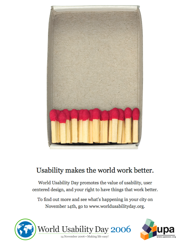
World Usability Day

I just found out that today is World Usability Day, and I couldn't help from laughing at the poster. Yeah, usability really matters. Enjoy. :-)

06 November 2006

Impatience and Design by Counter Example

“Don’t worry about other people stealing your ideas. If you’re ideas are any good, you’ll have to ram them down people’s throats.” - Howard Aiken, IBM Engineer

This is my favorite quote for the day. Innovation, with all the ideas and execution that it requires, fails to happen for so many reasons, but most common in my experience are these two:

1. Design by Counter Example

2. Impatience

Design by Counter Example

Suppose you come up with some fantastic idea, you are excited about it, so you begin to share it with your coworkers and friends. If your friends are smart, they'll begin to analyis your idea for weaknesses and flaws. They'll do this not because they don't like you or don't trust you, they'll do this because it's what they are trained to do. Find the problems and worse, find the 100% solution, the solution that works everywhere. You'll know these people because they'll often begin their comments to you with "No, but..." or "What about..."

The problem with the "No, but..." response is that it sets up conflict, and no forward progress in idea generation can be made until the conflict is resolved. Worse, conflict resolution wastes time and energy and discourages more idea sharing. The "What about..." response almost always follows with some scenario or example that counters your idea in some way. Your response will often be an attempt to resolve that counter example, which when solved will be rewarded with a new and different counter example. Corner case upon corner case, what was a clear, bold and brilliant idea, gets designed into a complex, multifaceted feature that is costly to explain, build and test. If you share your ideas with a team of smart people, this can happen in a disastrously quick manner.

Impatience

Impatience is perhaps the subtlest of innovation killers. You will need patience as you develop the ideas because it will be hard to teach your idea to others, and then once the vision is clear, it will take yet longer to actually implement it. Remember it took Steve Jobs 18 months to convince the record labels to let him build the iTunes music store. If you back down at any point in this long journey, that is when innovation dies. This is why I believe, in so many ways, it's all about the execution.

Ideas are important too, and when you are generating ideas, being creative, all too often a well meaning individuals will ask you to rate the ideas and place them in priority order for potential business impact. This is a good idea, but done too soon, it's like asking a 3 year old what valuable contribution he or she will make to the world, and bereft of any intelligible response condemning the toddler to uselessness.

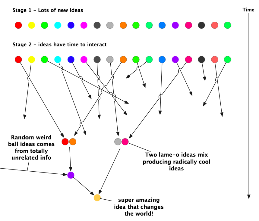
This impatience to see whether an idea is good or not kills innovation because the real innovation happens generally not in one brilliant flash of light, but at the interaction of ideas, and often ideas interacting with others in the periphery. I first heard Steve Jobs coin the phrase, "connect the dots backwards" and I think this applies here. You can't tell what will be important until after the fact, after the interaction. What you need is a safe place for lots of ideas to interact with out getting shot down. It looks like this:

Creating an environment where ideas can patiently interact and people can interact with the ideas before making the "do or die" business decision is key. What's even more important than the ideas, is that you don't kill the idea generators and integrators, that is, the people! Consider this story related by Heike Bruch and Sumantra Ghoshal in the February 2002 issue of the Harvard Business Review:

"In a major U.S. oil company, for example, we witnessed a committed and enthusiastic manager gradually become apathetic. An IT specialist, he was assigned to an inter-disciplinary strategy-development task force that was charged with creating a new business model for an up-stream division. The team came up with several radical proposals, but they were met with lukewarm responses from senior managers. After several months, the team's ideas were diluted to the point that not even the IT manger found them interesting. What had once been an exciting task became a farce, from his point of view. Believing that no one was interested in new ideas, he concluded that he was foolish to have been engaged as he was. "I distanced my self," he says, "I knew that none of our innovating ideas would ever make it to implementation. So I continued working out concepts and ideas-but with no skin in the game."

To be fair, even the best organizations occasionally create cynics out of enthusiasts. But some organizations seem to make a practice of it by constantly sabotaging any flickers of creativity or initiative."

When creativity flickers, don't let the cold winds of cost benefit analysis prevail. Provide the fuel of saying "Yes!" and patience to wait and see, even if you must suspend your disbelief. This will give people the space and time they need to make great things happen. Remember it took Michelangelo years to complete the Sistine chapel and Goethe spent almost 60 years writing his masterwork Faust. Good things take time.

So, if you want to be innovative here's my advice:

  • Focus on execution, on making ideas reality. For every thousand great ideas, only one reaches someone with the courage to actually do something with it.

  • Stop saying "No, but...", learn to say "Yes, and...", find a way to talk about ideas that adds more and moves them forward. Give folks what they want. Suspend your disbelief.

  • Be patient, great things take time. The really great ideas are going to be a collision of ideas. Let them grow so they can interact.